• CASE STUDY
03/04
Café Život
Project information
“Život” (Croatian) simply means “Life”. The owner of the café has implemented her life’s philosophy into the way the café operates, and in the service that it provides to its guests. Život is the first Croatian, 100%—vegan café.
While you can enjoy a cup of coffee with a seaside view, Život represents more than that — it’s about supporting a community that lives harmoniously with nature.
How to present an original design solution that combines a vegan lifestyle with a classic service industry such as a café / bistro — while avoiding clichés and the use of generic symbols like coffee beans, coffee mugs, etc.
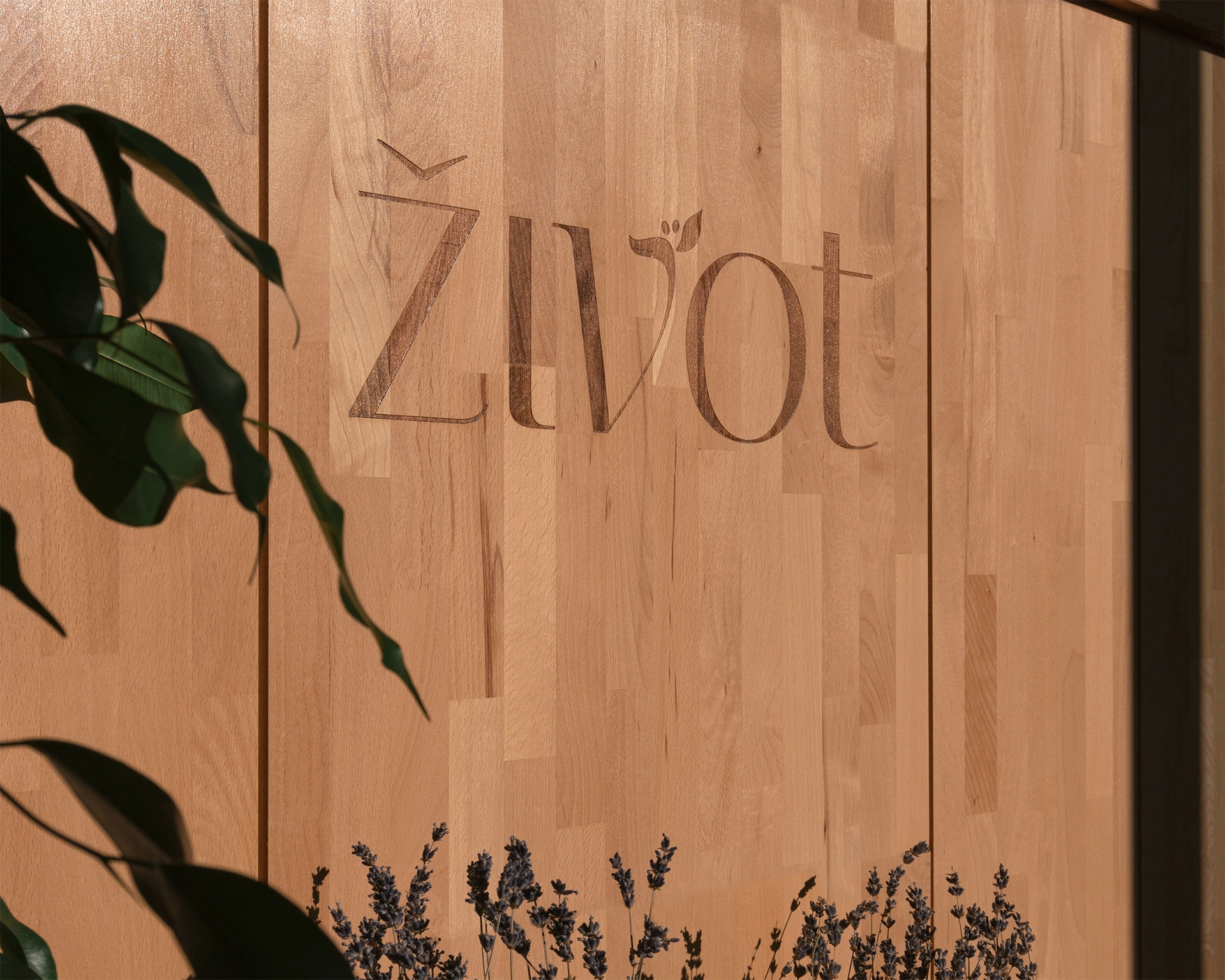
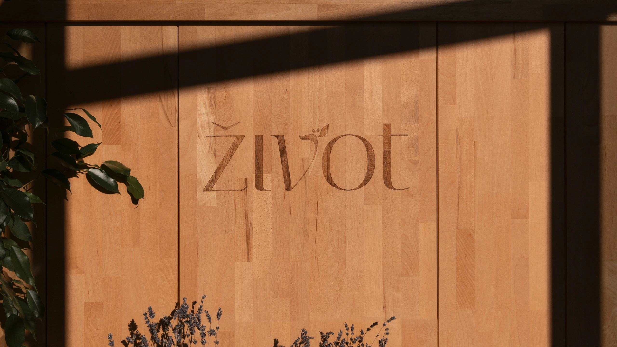
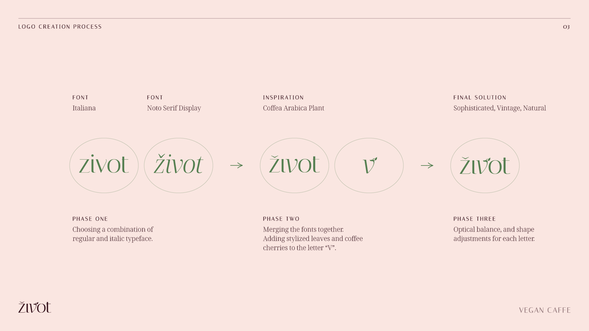
The solution is a concept that combines the idea of Veganism with the idea of quality–specialty coffee. The concept is achieved through a stylized representation of the Coffea Arabica plant — which is integrated into the logo. The motif embodies both the coffee aspect, and the natural values that the café represents.
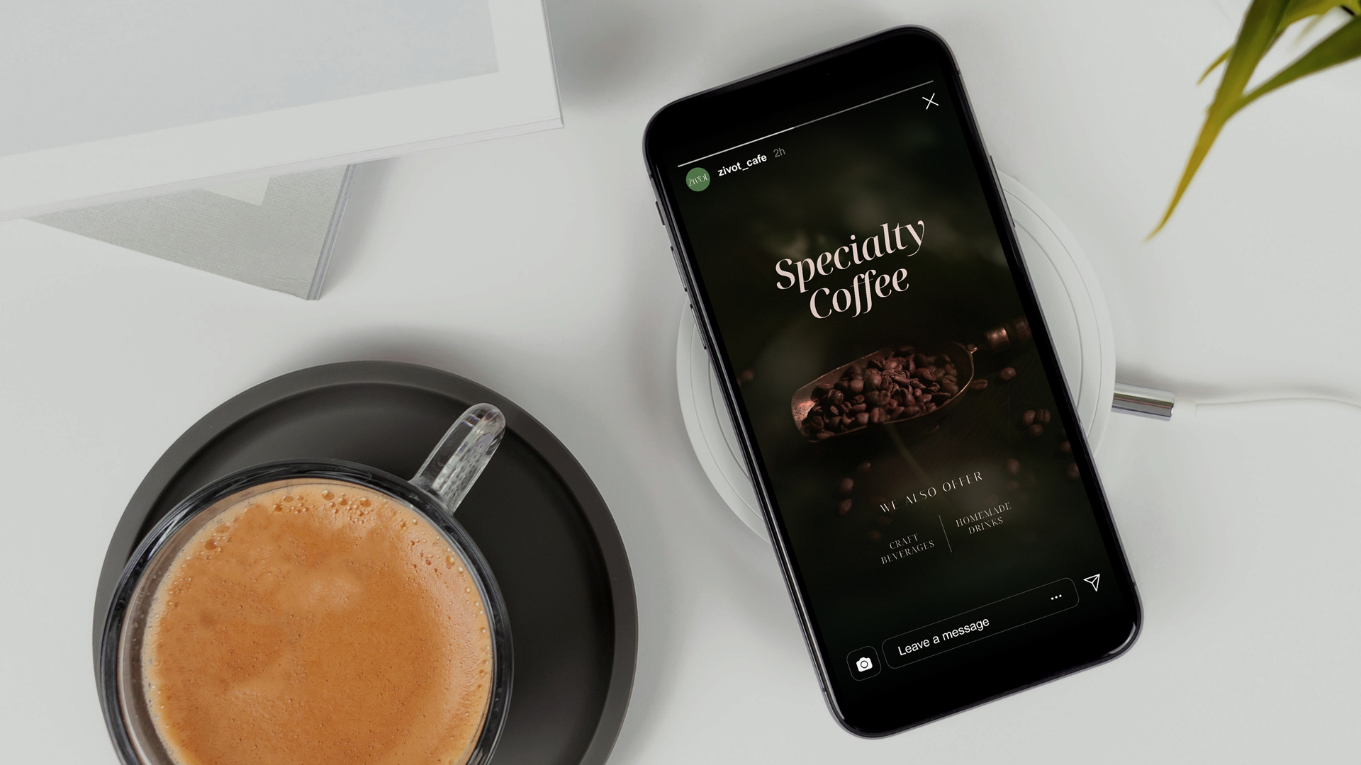
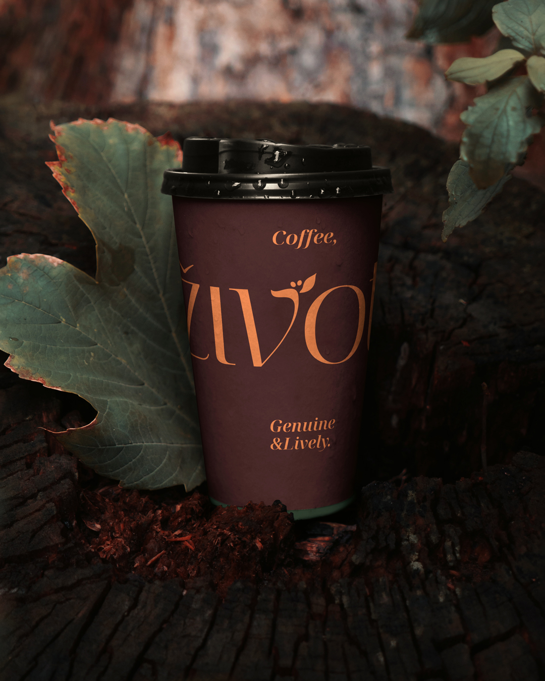
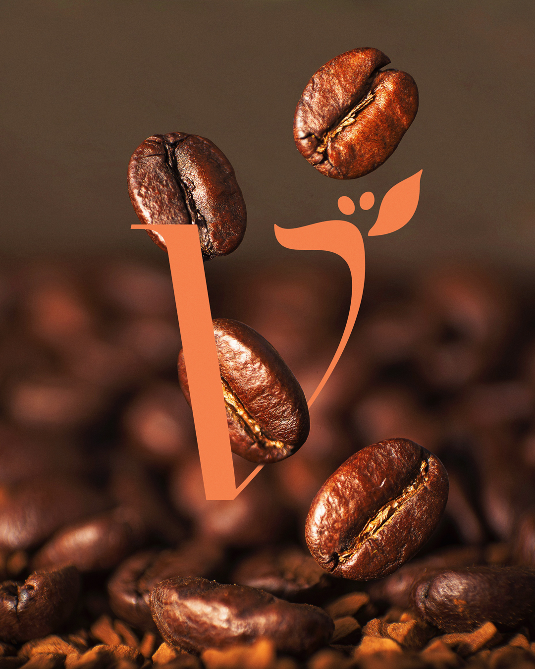
Logo
Design
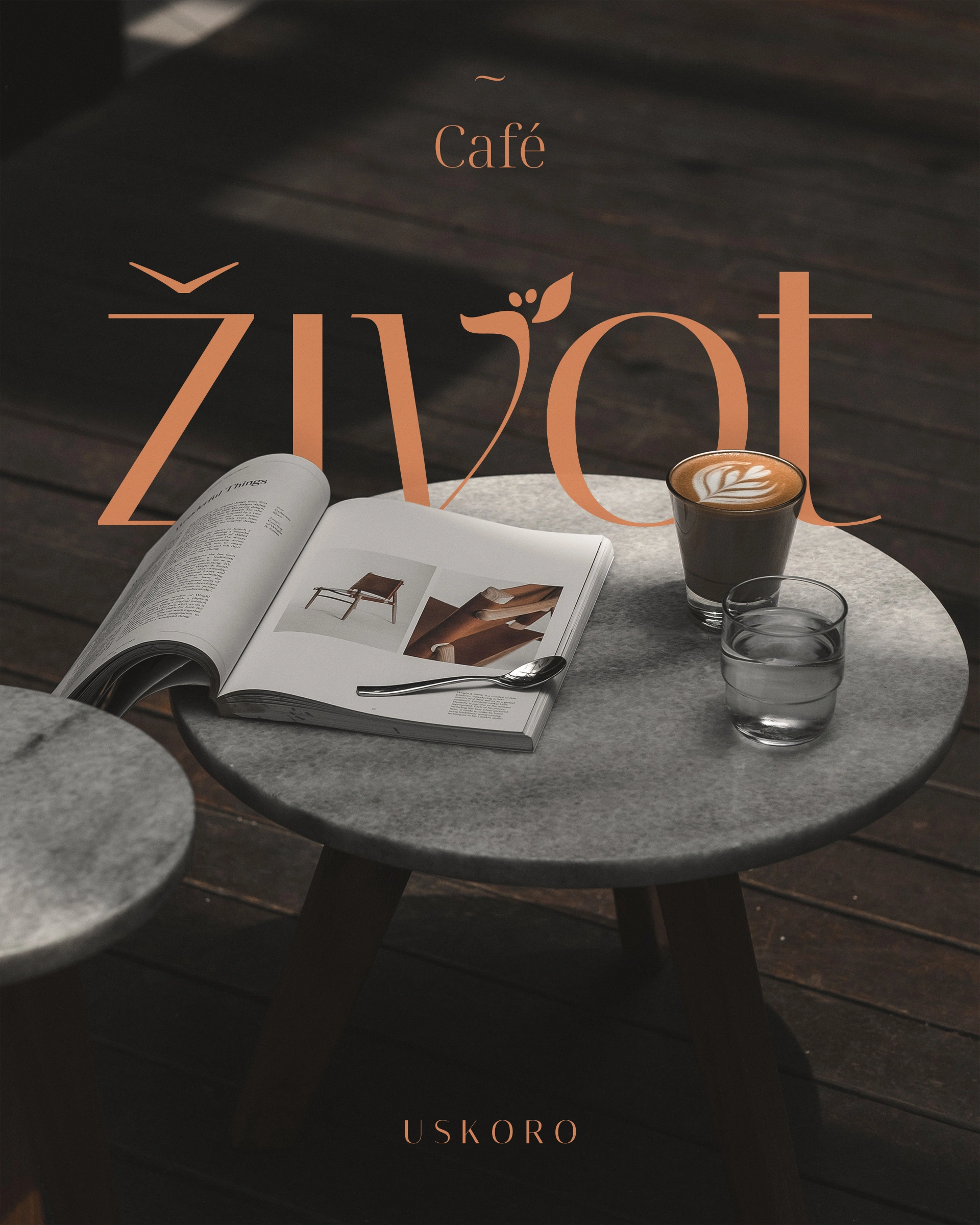
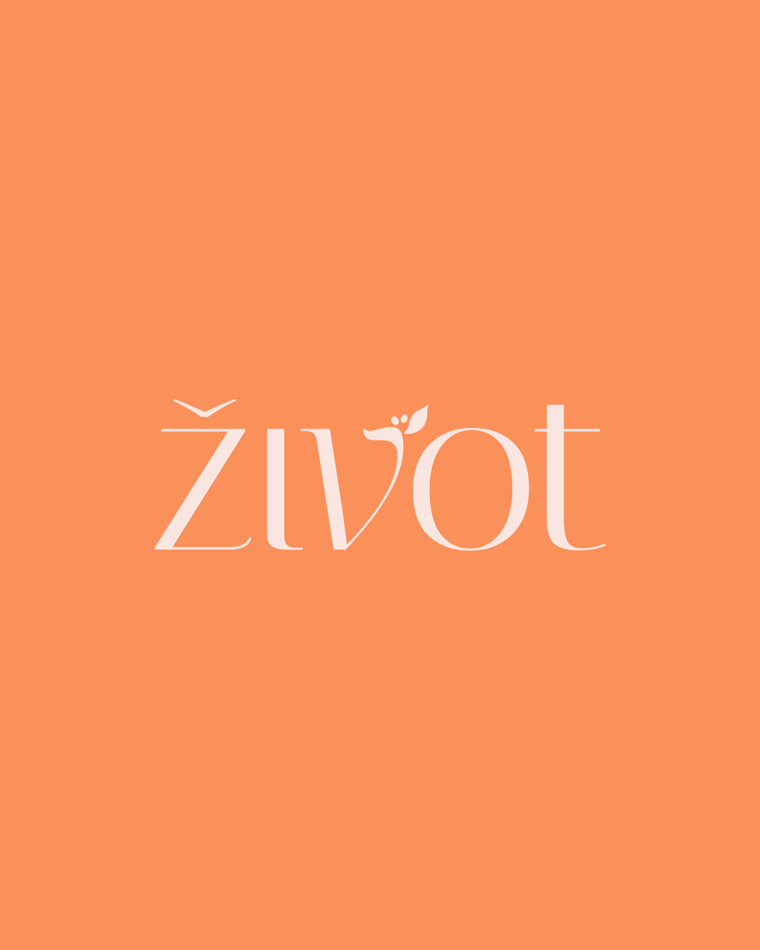
The solution is inspired by the motif of the Arabica plant, i.e. its leaves and fruits (coffee cherries). The motif showcases the natural, organic aspect that is part of Veganism. The second part of the problem is solved by using carefully selected fonts that ultimately form a typography-driven logo, whose lines & shapes are subtle but have strong enough visual associations with coffee-related products, coffee drinks, coffee shops etc.
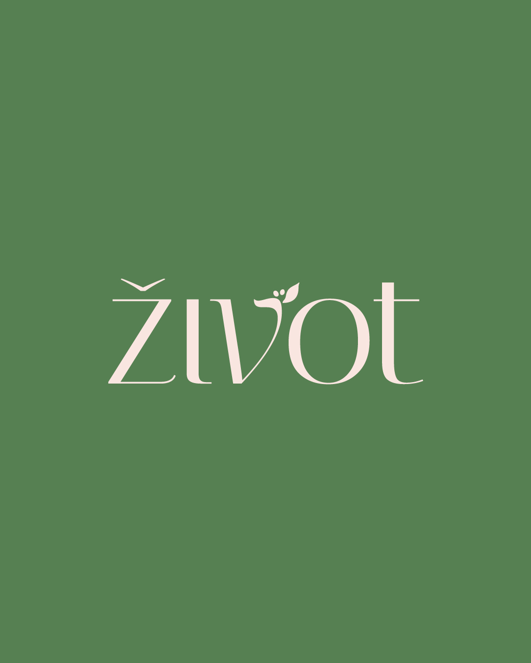

Visual
Identity
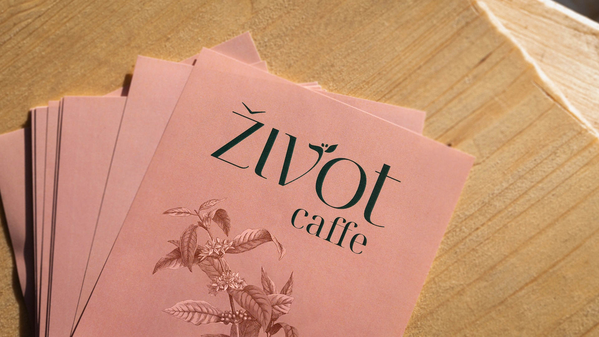
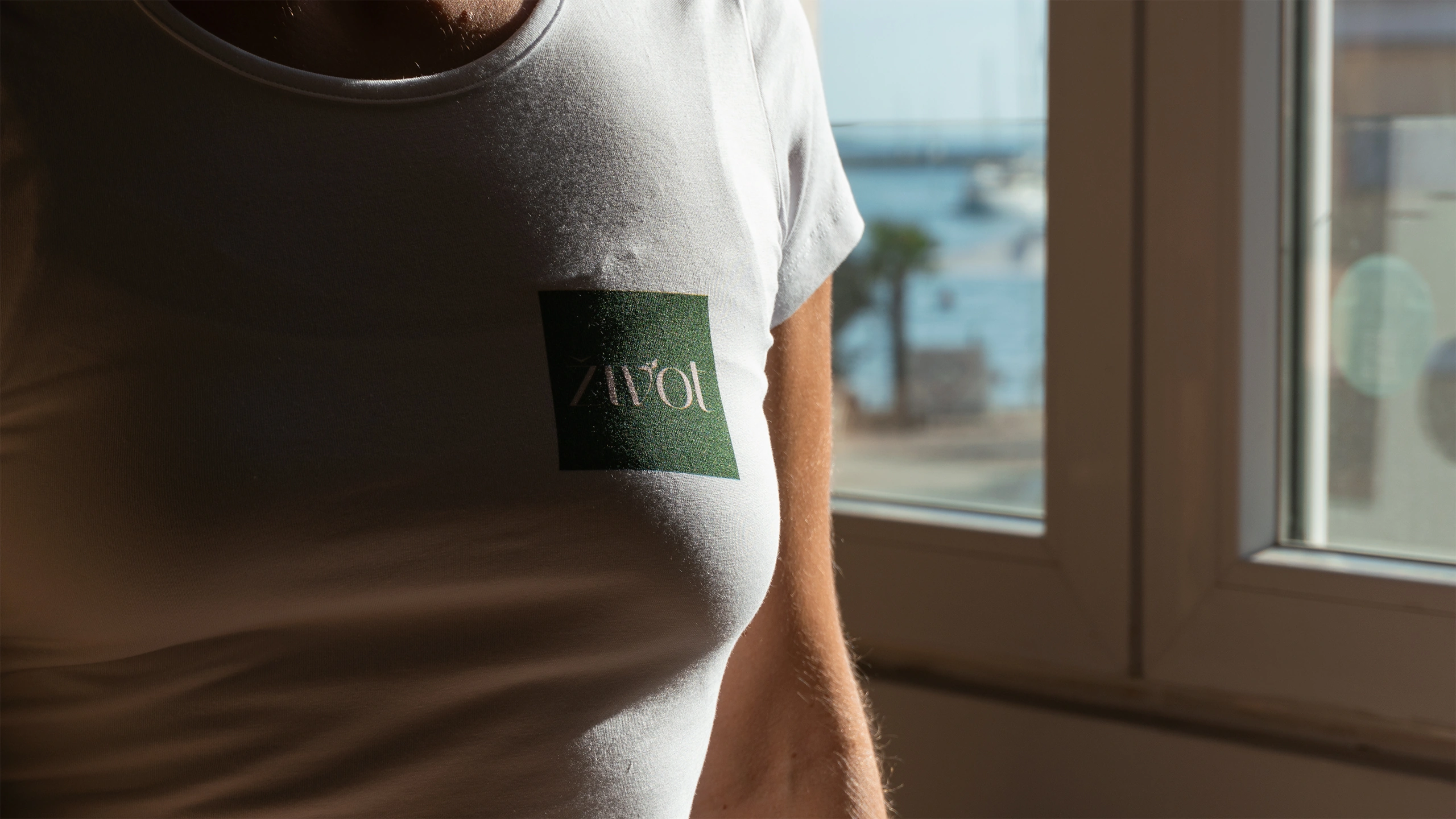
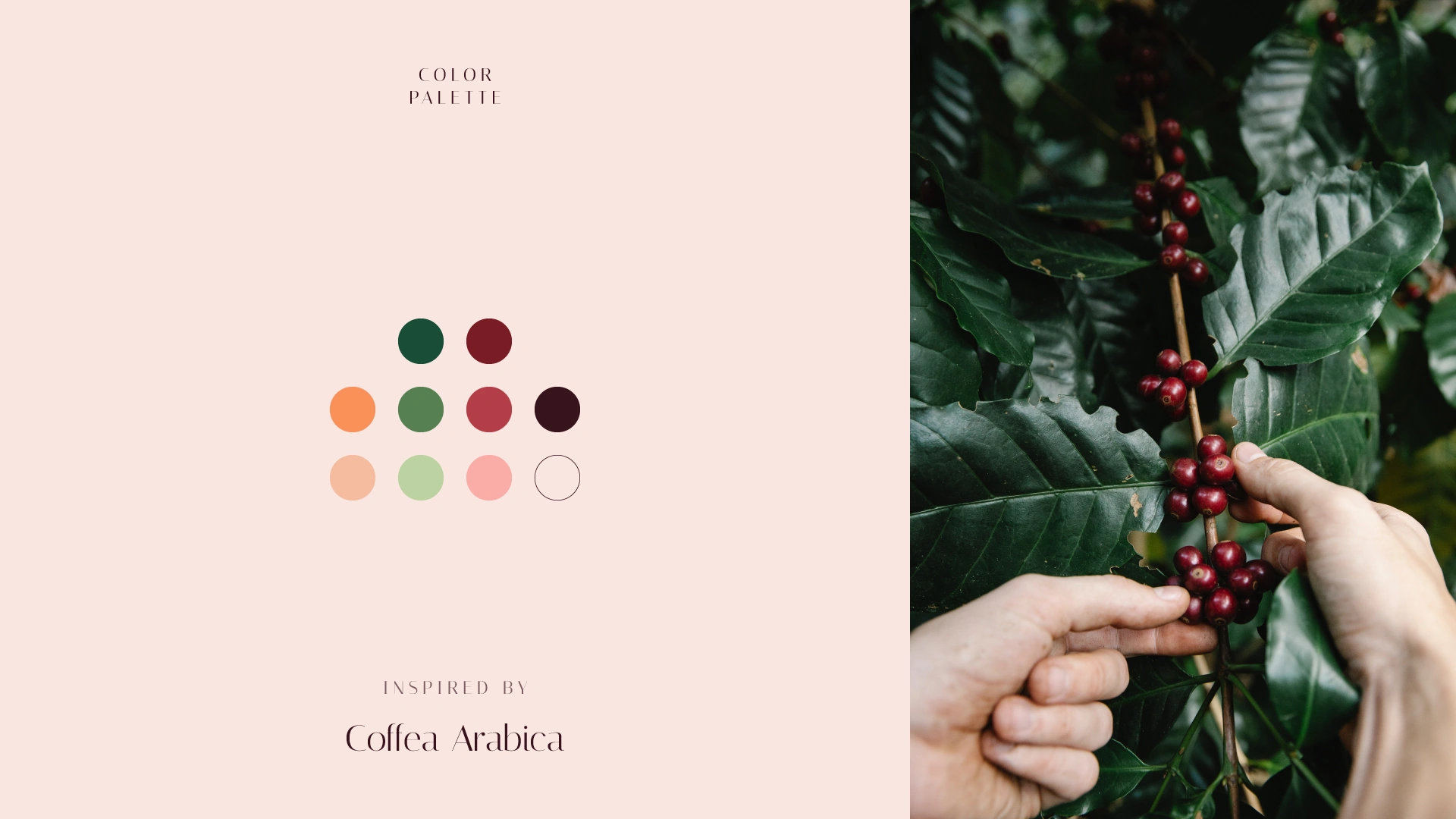
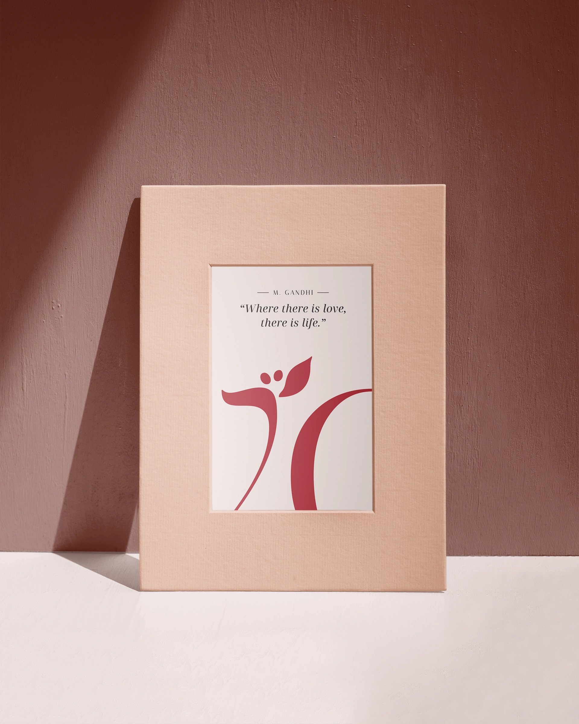
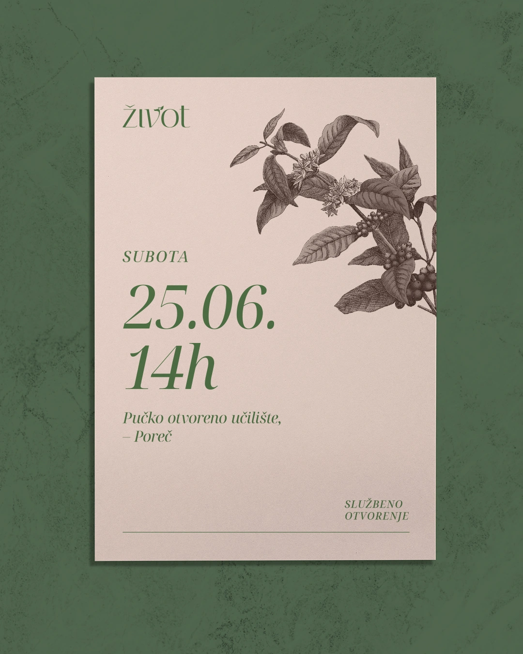
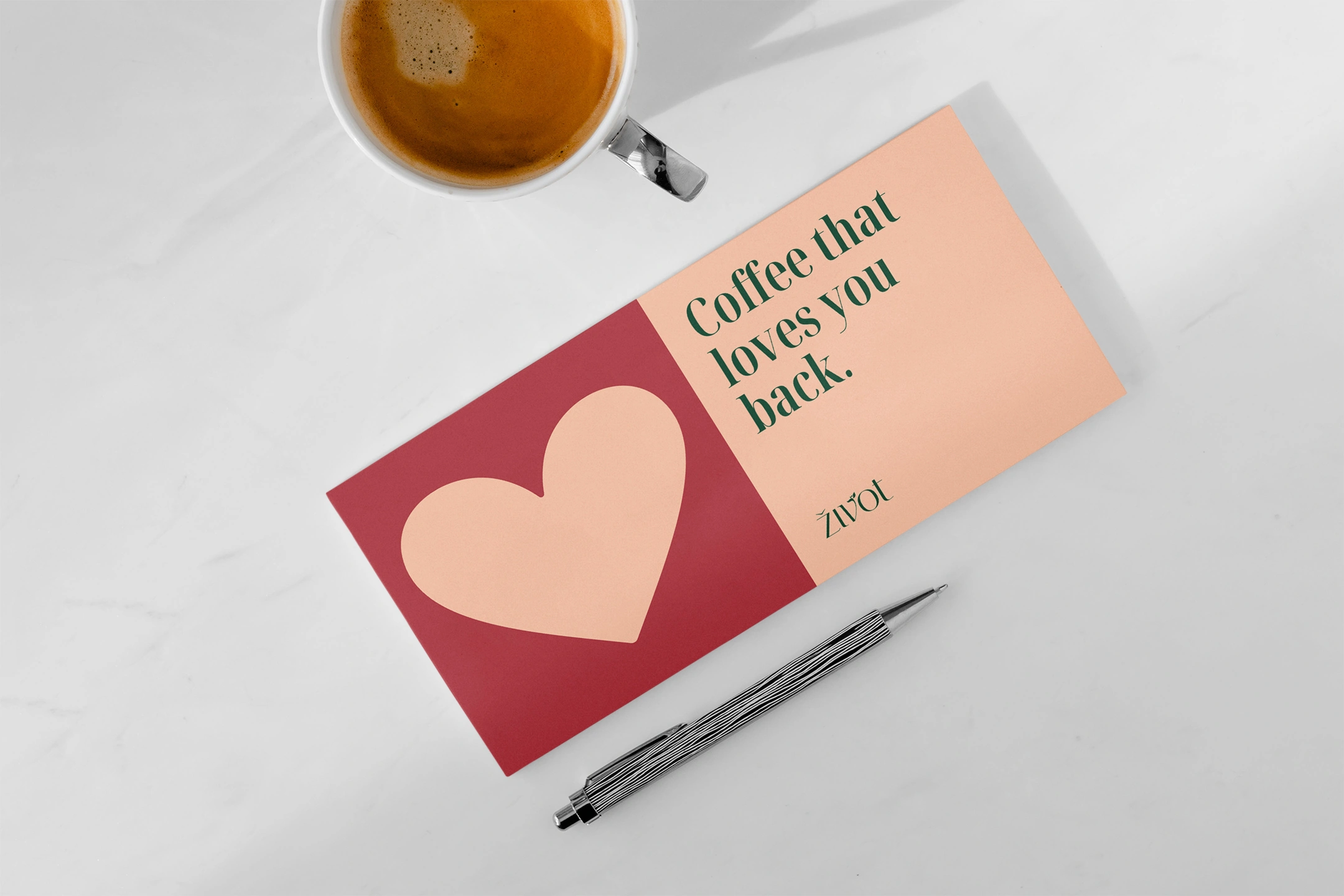
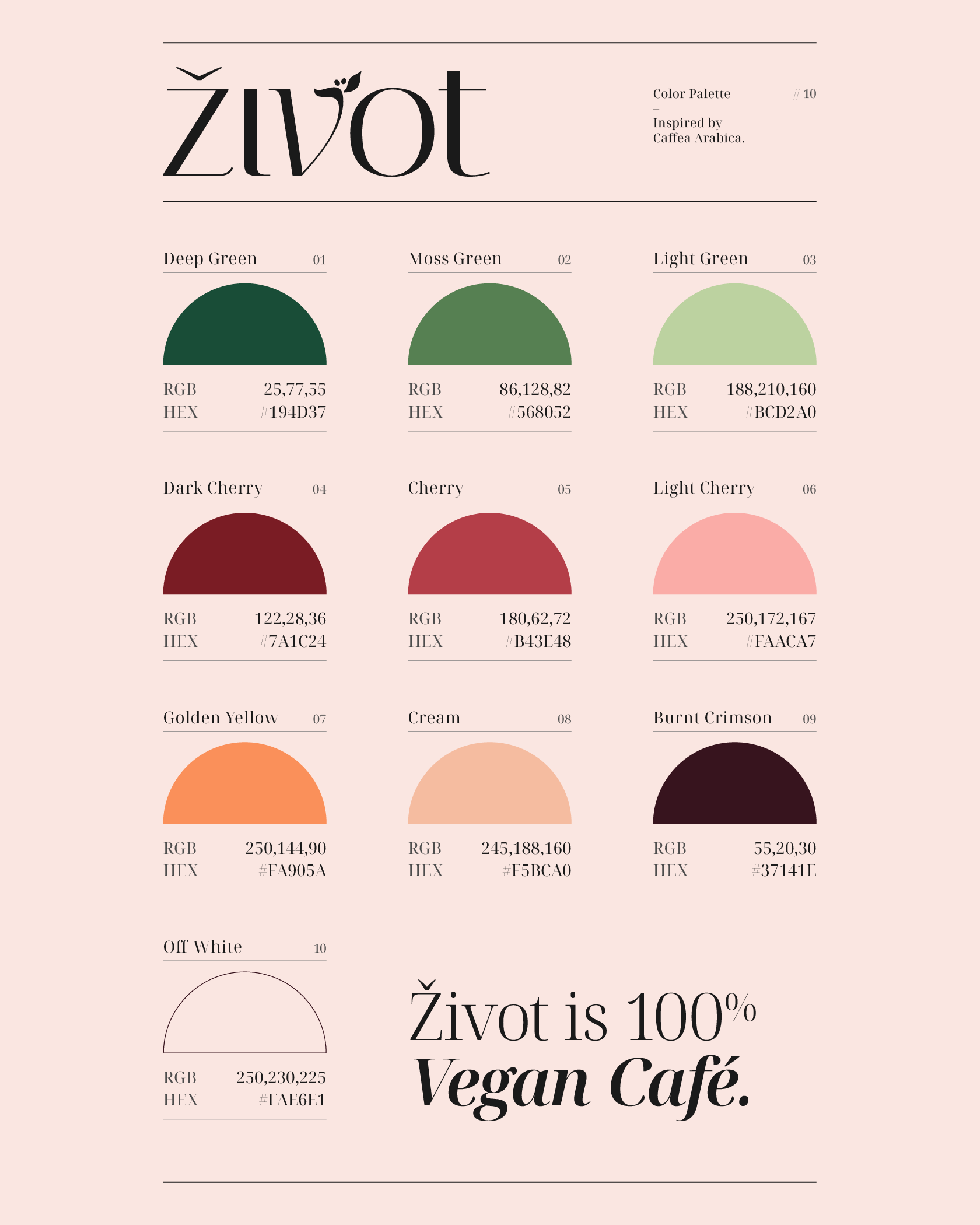
The visual identity extends through the color palette, typography, illustration and composition / grid system. The color palette is also inspired by the Coffea Arabica plant — the colors of its leaves and coffee cherries (before harvest). In addition, the palette contains several other colors inspired by the appearance of different coffee drinks.
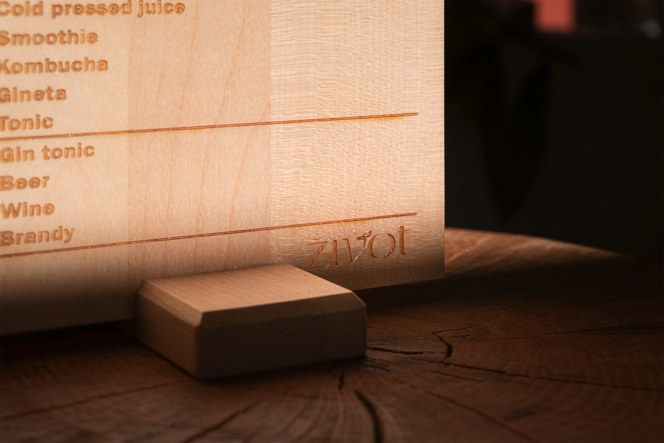
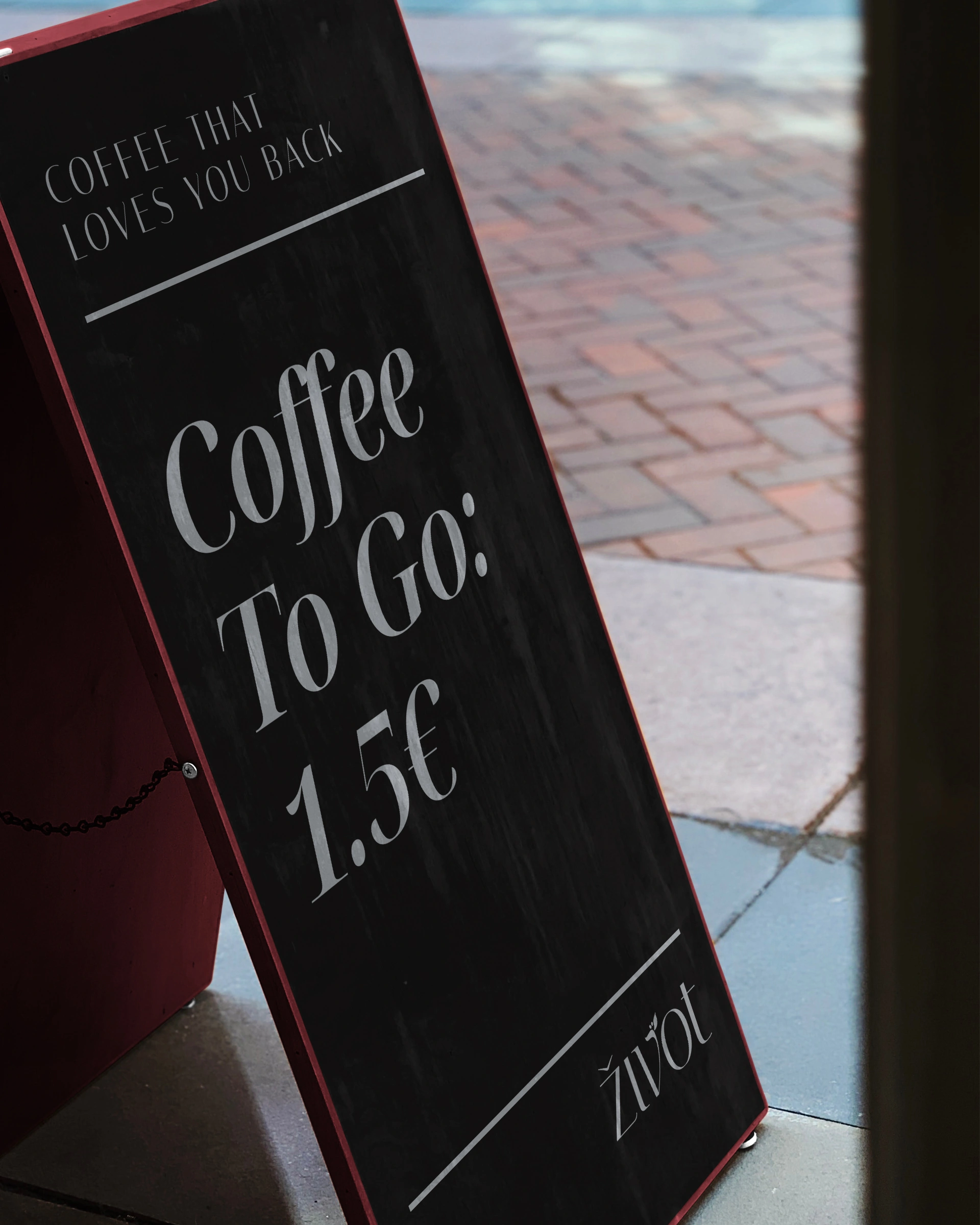
The typography derives from the fonts used for the logo, where regular and italic versions are also mixed. The illustrations are detailed, almost like drawings, which is why they are simplified with a monochromatic application.
The visuals contain a minimal number of elements, often with a centered composition, with a lot of negative space. Contrast / hierarchy is most often achieved through changing the proportion / size of elements within the composition.
Photography
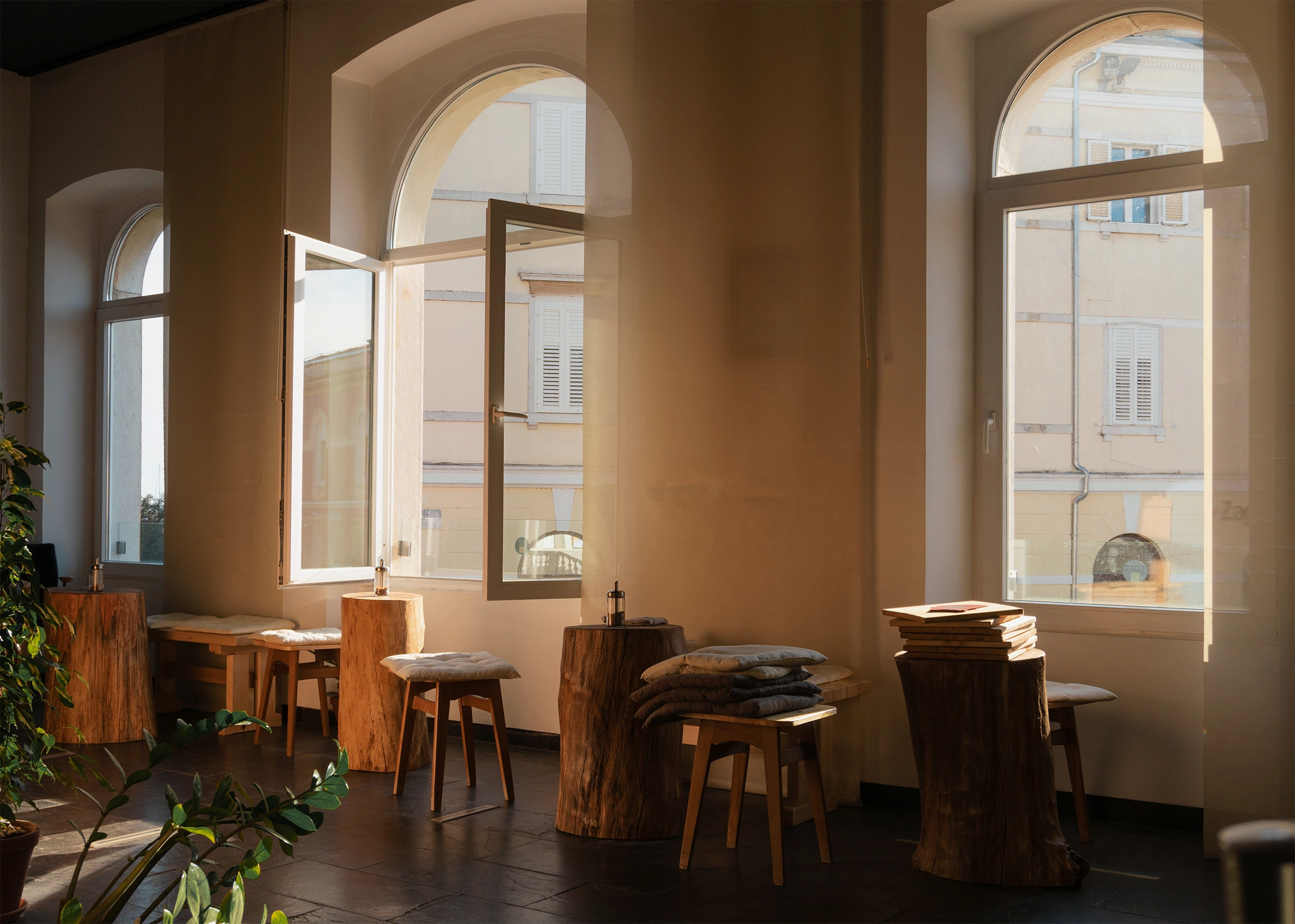
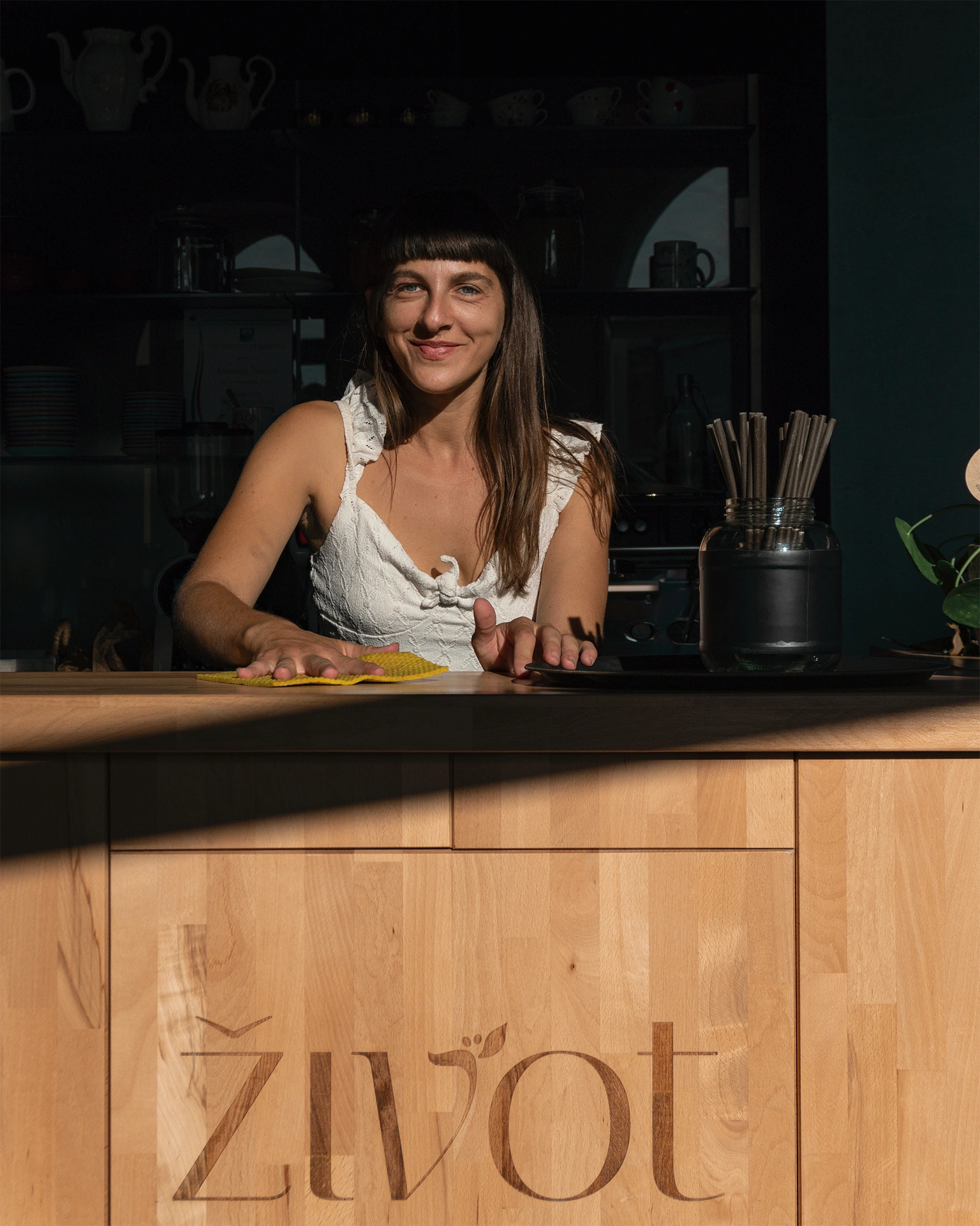
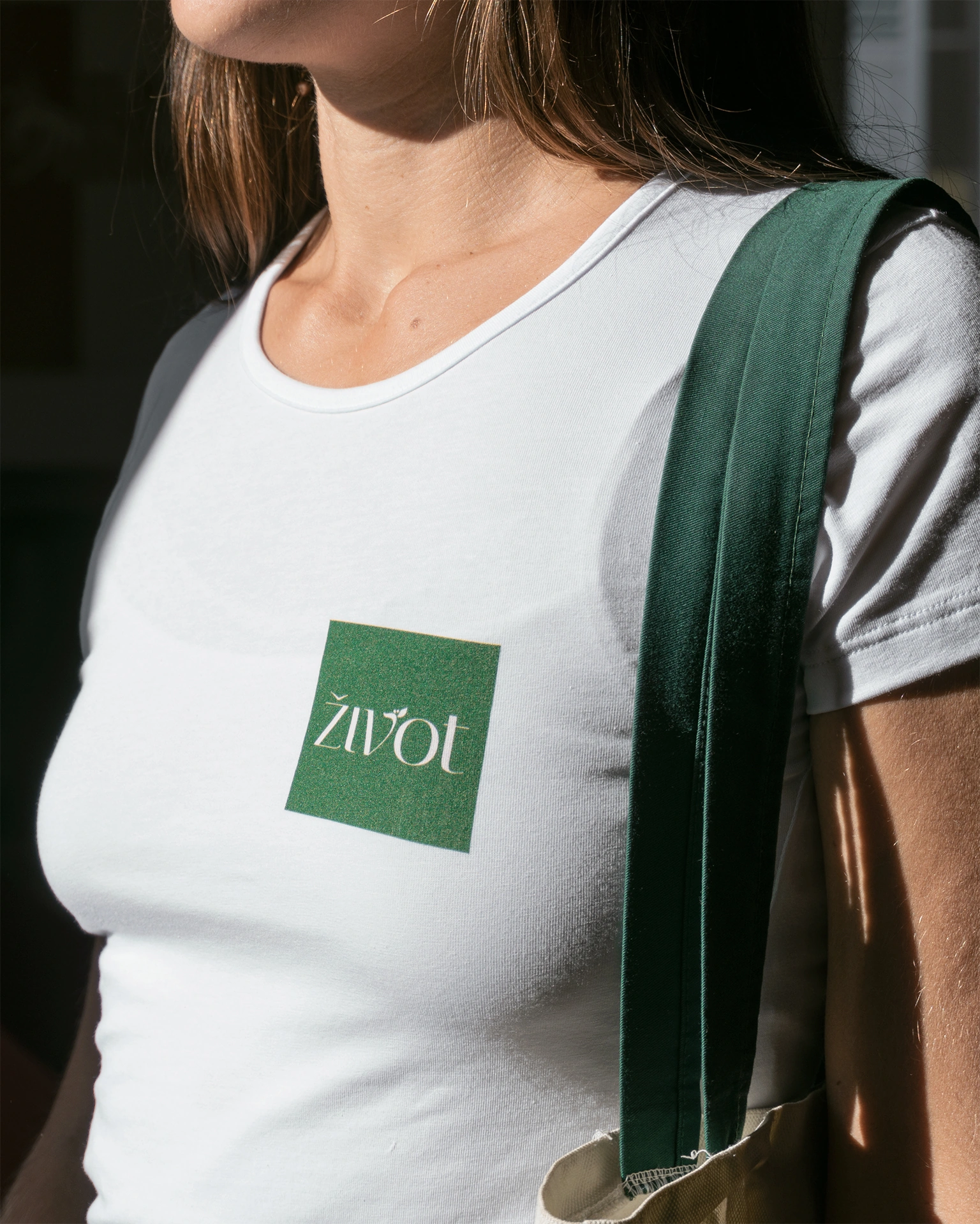
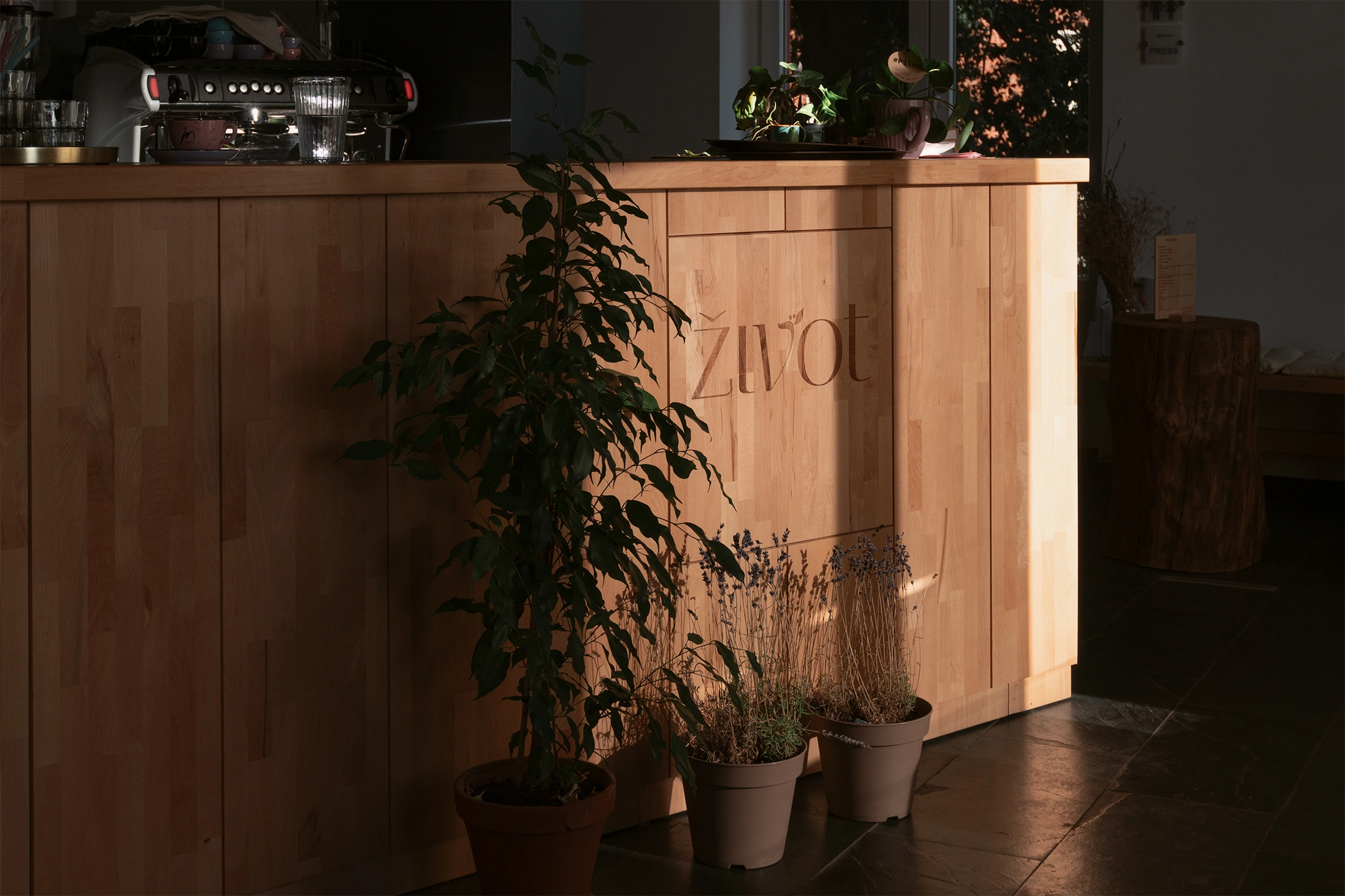
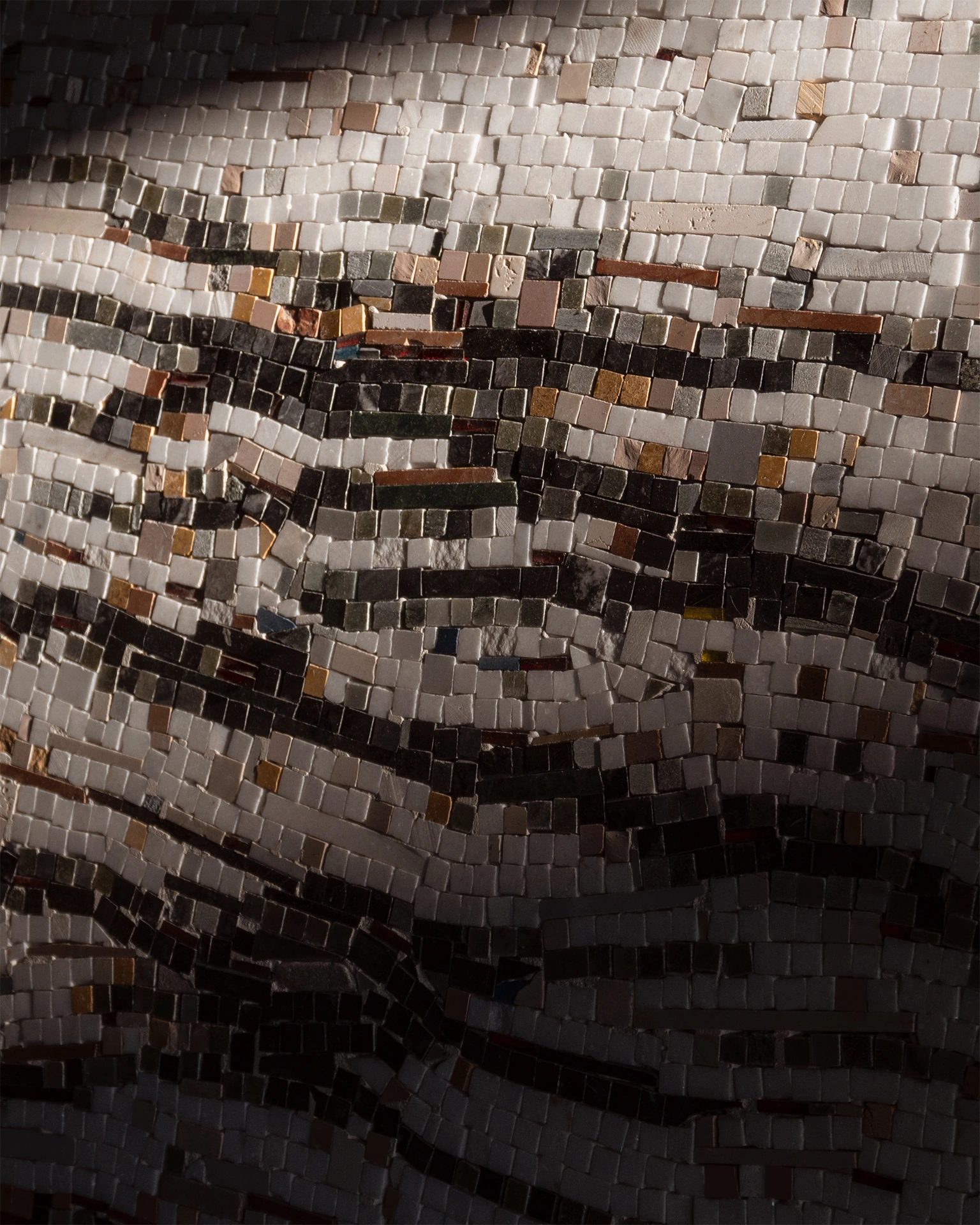
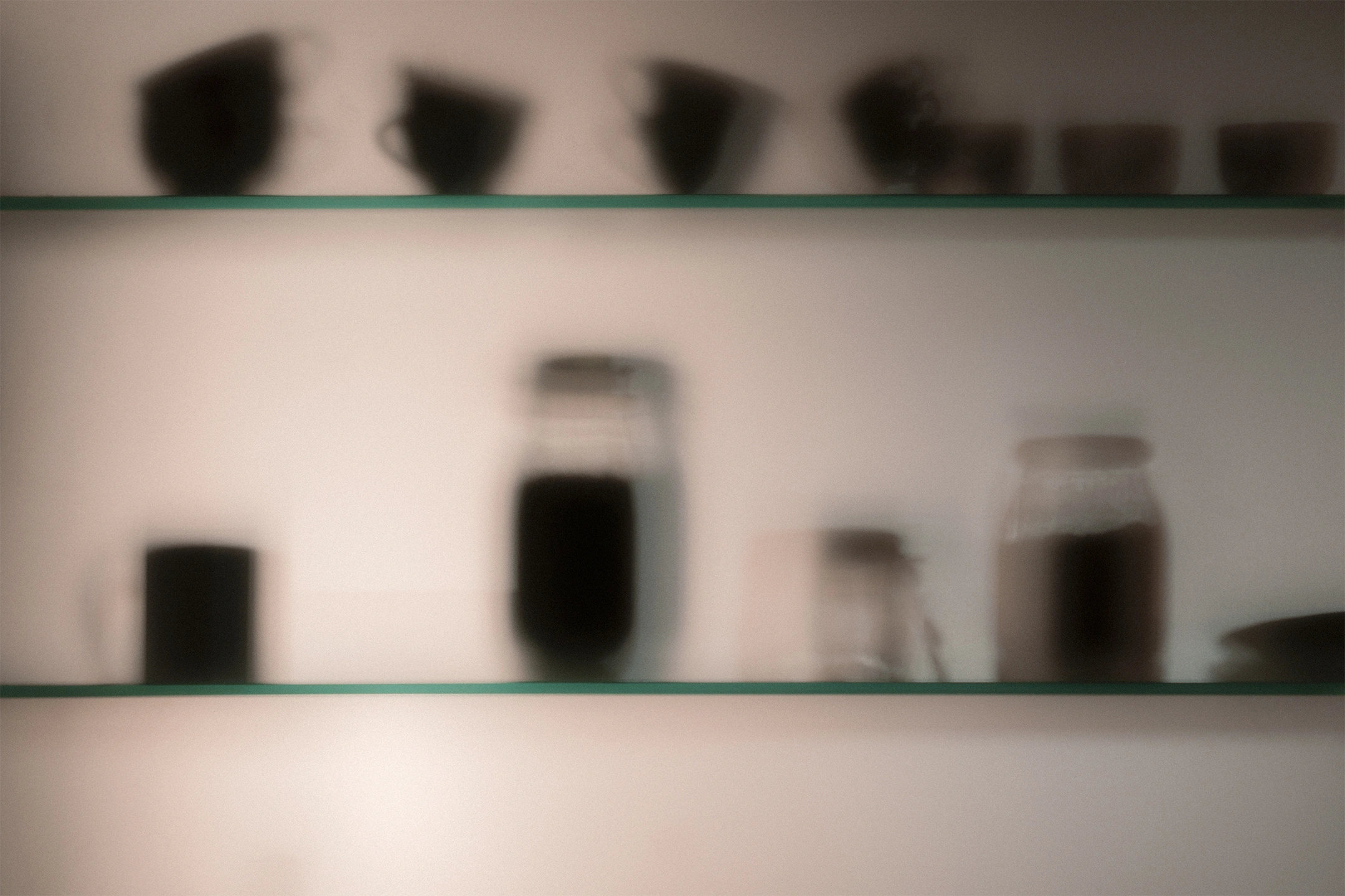
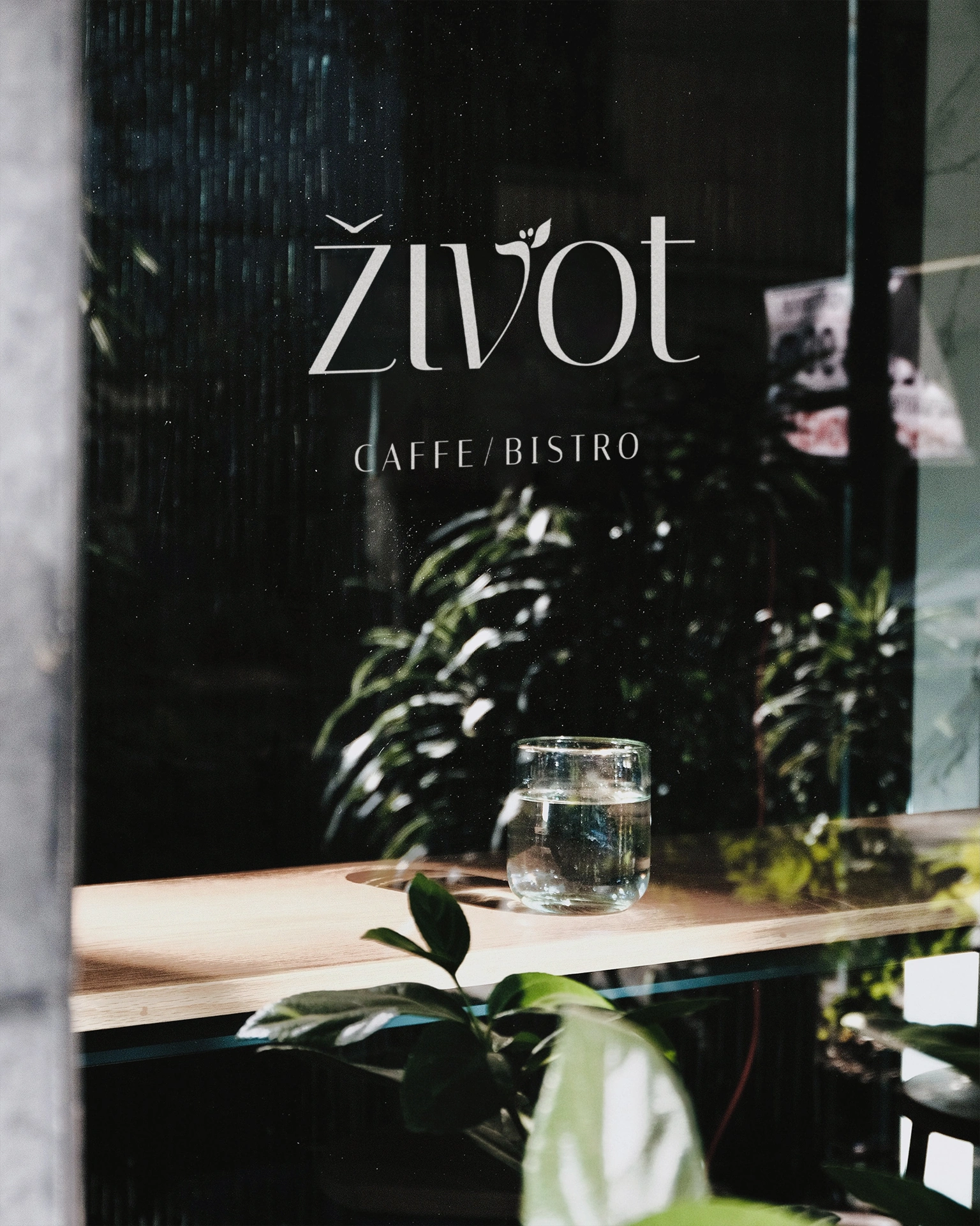
The photography style tends towards a more artistic and less commercial approach, as it wants to achieve spontaneity and a natural feeling that is consistent throughout the rest of the cafe’s identity. To achieve this, only a natural light source, i.e. daylight, was used.
This also emphasizes the elements that make up the interior — tree stumps, plants, wooden tables and a bar. It’s as if we see the arrival of nature, slowly fulfilling the café.
Ultimately, the photos convey a sense of nostalgia, with a hint of mystery, but also calmness, openness and acceptance.
